The ecosystem is composed of a wide diversity of biotic beings and abiotic elements, with similar appearances at first glance. However, if we look closely even in elements with similar shapes, we find subtle differences that give beauty and complexity to the natural world; for example, an element as small as a snowflake is unique and unrepeatable.
However, if we focus on analyzing the analogies presented in nature, we will find that it is based on related and reduced forms. Although it may seem contradictory, these designs and geometric forms are presented in different contexts and turn out to be particularly restricted, so that the immense variety of forms that nature creates arises from the elaboration and reelaboration of a reduced number of basic themes. Such limitations are what give harmony and beauty to the natural world (Stevens, 1986).
Limited and repeatable designs are present in the natural world, producing patterns that relate to each other. Being aware of the existence of these patterns and what their geometric shapes represent is useful for a graphic designer when creating a logo, since they serve as an approximation to the personality of the brand to be represented, with a completely universal concept of compression.

The following is a detailed description of each of the patterns that can be found in nature and their usefulness when creating logos.
Flow patterns
Flow patterns create similar geometric figures that repeat themselves constantly, starting from an initial point that will increase; this fluid exchange of constant energy will eventually take place until it disappears. In nature we find this pattern present in the currents of rivers, whirlpools, sea waves, among others. From the large eddies, small eddies are born, which feed on their speed, and from the small ones sprout other even smaller ones and so on according to their viscosity (Stevens, 1986).
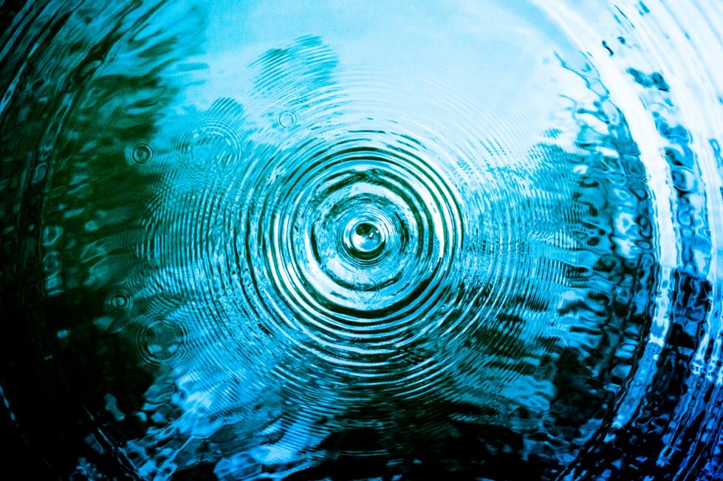
The design studio Human Design Bureau, designed the logo for the Indian Ocean Commission (IOC), using geometric figures that emerge in successive access, as shown below. The IOC's mission is to strengthen ties of friendship between countries, create ecological sustainability projects to improve the conditions of their inhabitants and preserve natural resources. It is the only organization that brings together these small island states. It can be seen how the flow pattern represents what the IOC wishes to convey. The design studio by using this flow pattern creates a spontaneous and fluid union between the five regions, conveying how the ties of friendship, cooperation and communication between the islands is constant.
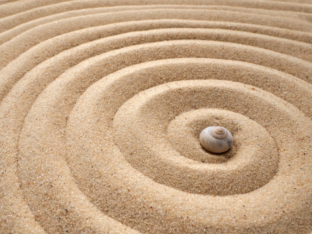
Spiral patterns
The spiral pattern is one of the most visually attractive geometric patterns, due to its shape, versatility and balance between opposites, united by a central axis that is invisible to the naked eye. The spiral is the initial figure of human or animal life. An embryo will begin to grow with its spine in the shape of a spiral. This leads to this pattern connecting energy to each other, evoking a new beginning.
The renowned graphic design studio Landor was asked to redesign the logo for British Petrolium, the third largest oil company in the world. This company's new vision and strategy was to convey its innovation, progressiveness, performance and respect for the environment. You can see how the rotations evoke the figure of a sunflower using the sun's energy. The use of this pattern helps to convey the new vision of the brand completely.
Helix patterns
In the case of this pattern, a uniform path will always be maintained, with the same diameter. Usually this movement communicates information between opposites working together to form an element, which will concentrate energy to be used for a single purpose.

Identifying the existence of natural patterns, their principles, geometry and role, are fundamental for a graphic designer when creating a logo, since it will lead him to develop an aesthetically interesting corporate image with solid foundations and concepts. The use of these geometric patterns guarantees that your design will have a global understanding, since nature is present in the life of all human beings, regardless of their place of origin or context.
María Paula Valarezo
Teacher